
i knew it would be good...i didnt know it would blow my mind!
the scene involving bobinski's mice circus was extremely relevant to our project: a heavily stylised brightly coloured world. Anyway...theres something else...that bunting mr grigglesworth (im still not sure its called that) anyway...take a gander at what they used for the film....just two colours...im thinking perhaps we have too many colours going on...as jared said they dont seem to fit in with the rest of the set. Perhaps we should limit ourselves to just 2 colours, green and yellow are used here but we dont necessarily have to use that.


im of course speaking of Henry Selick's film Coraline, based on the children's story by Neil Gainmen.
each character carefully considered, wonderfully animated and uniquely designed. the story is fully developed and thank god did not depend on its true 3d, instead its quite subtle, not in a "oi wheres the 3d like?" but nothing like you were waiting for the next bit of the "ghost train" effect. This film seemed to have everything wrapped up in a neat package...and you have to love the style of this film. Wonderful collation of humour and evil...i wont spoil it, its one you should all see though!
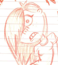
one of my favourite characters, Mr Bobinski...a mass of exaggeration going on with this nut case.
the scene involving bobinski's mice circus was extremely relevant to our project: a heavily stylised brightly coloured world. Anyway...theres something else...that bunting mr grigglesworth (im still not sure its called that) anyway...take a gander at what they used for the film....just two colours...im thinking perhaps we have too many colours going on...as jared said they dont seem to fit in with the rest of the set. Perhaps we should limit ourselves to just 2 colours, green and yellow are used here but we dont necessarily have to use that.
what do u reckon?


No comments:
Post a Comment